How to produce a Grumble...
I wrote and drew Grumbles for about 12 years, but this was me sharing my comic strip creation processes after around 6 years in. This was an evolving process, but it should give you some idea of the my digital methods at the time.
A version of this first appeared in the second collected year of Grumbles strips, strangely named Grumbles Like this You Don’t Know from...
The first step in the creation any given week’s strip is getting good and ticked off about something. I might read something on the web, or hear it on a podcast, or run across some idiot at the store, or hear someone talking in the bank, or even read a bumpersticker on a car. It really doesn’t matter where I came across that certain thing that ticked me off, but it usually would be the sort of thing that makes me turn to my wife and say, “Do you believe that?”
Apparently, that phrase is some sort of Midwestern affectation of mine, because, yes, she usually would believe that such stupidness could exist in the world, when I guess what I really wanted to know was whether that person, place, thing or event was in reality as crazy, stupid, annoying, or ignorant as it sounded.
After I confirm the annoyance’s place in reality, I take some time to think about the strip I think about how I could best communicate my outrage to my audience. Sometimes I come up with ideas while walking in the neighborhood, or sometimes I plot out the entire strip while laying in bed early in that dark existential hour of the morning.
I frequently do some amount of web-browsing as research on most of my strips, unless it’s a “slice-of-life” strip. I’m quite a stickler for accuracy, and sometimes spend days getting just the right quote, or making sure that I really know something before I start writing about it.
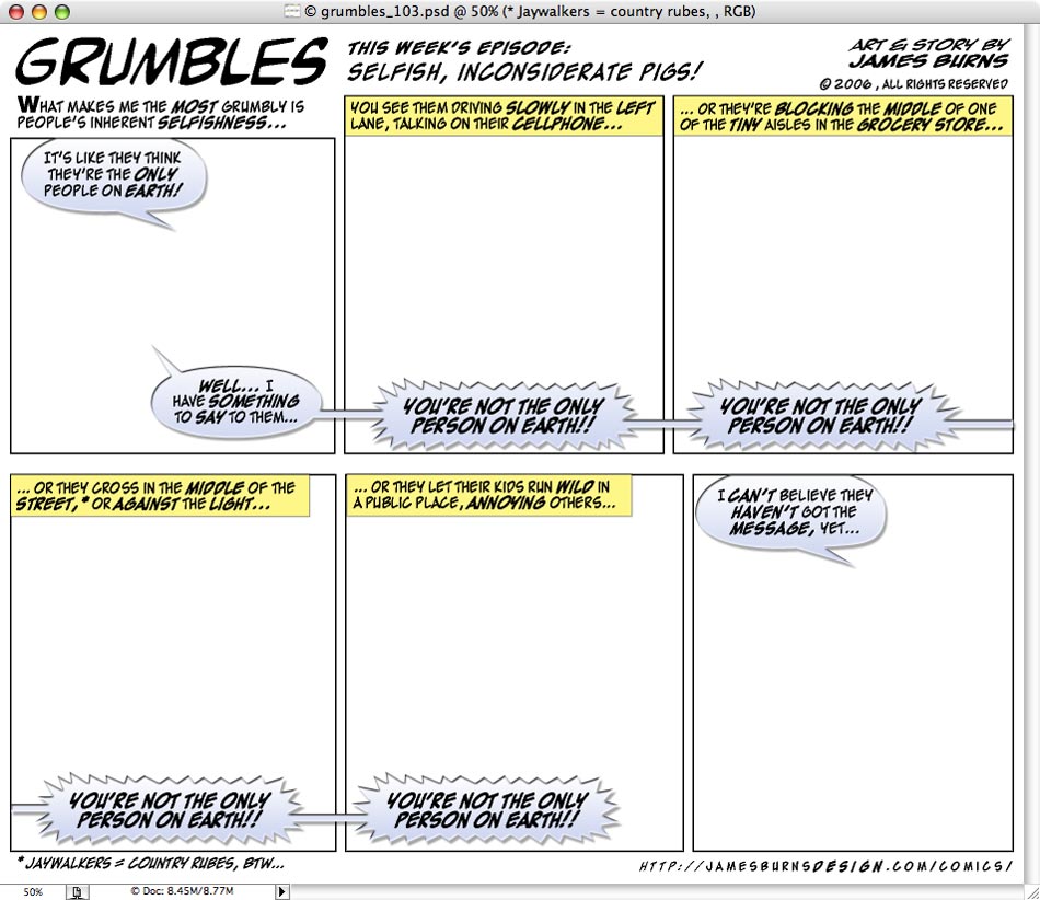
The writing process usually begins by opening a templated page in Photoshop. I write directly into the blank page, breaking it into panels, while trying to keep some visual image in mind as I work. Usually I try to keep it to 6 panels or less, although sometimes I’m overly ambitious and it’ll end up be as many as 8. I live for the strips that involve 1 panel, and some over-riding powerful message to justify my laziness.
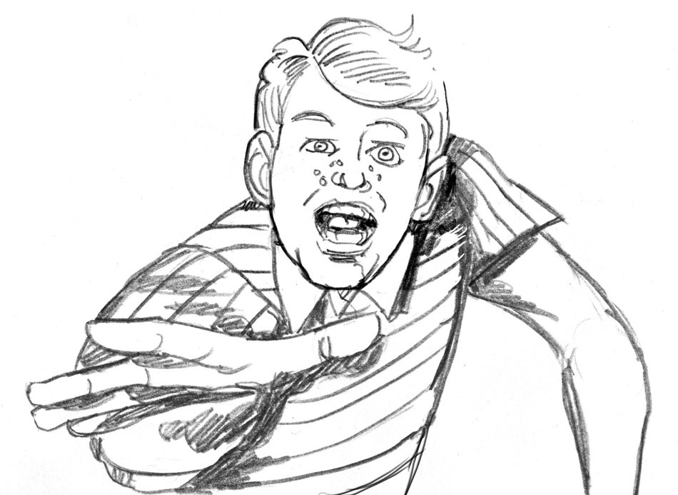
Then I get to sit down and draw the images for each panel in a rough form in pencil, each panel separately on a page. This can take a morning, or a day, or sometimes all week if it’s particularly elaborate, or detailed, or if it’s one of those times when I’ve seemingly lost the ability to draw that week (this happens more than I care to mention...).
For visual references I’ll frequently resort to the hack of going to Google Images and looking at a few pictures while I draw. Usually I’ll do that if I’m drawing a recognizable person, although my level of realism when it comes to portraiture is a matter of opinion.
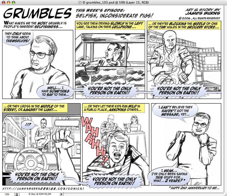
The drawings are then scanned into the computer. There I do some minor repairs; things like erasing stray marks, straightening lines, correcting proportions, and sometimes extending the drawings, again all using Photoshop. I arrange the drawings in the panels, adjust dialog balloons and other text, and check to see how it reads at this stage.
For the first year and a half of producing Grumbles (through week 94...), I would then take those raw drawings, make them high-contrast (using the “Levels” command in Photoshop), and then add color, using my original pencils for the final product. It was certainly the easiest method, but I wasn’t always satisfied with the final, finished result.
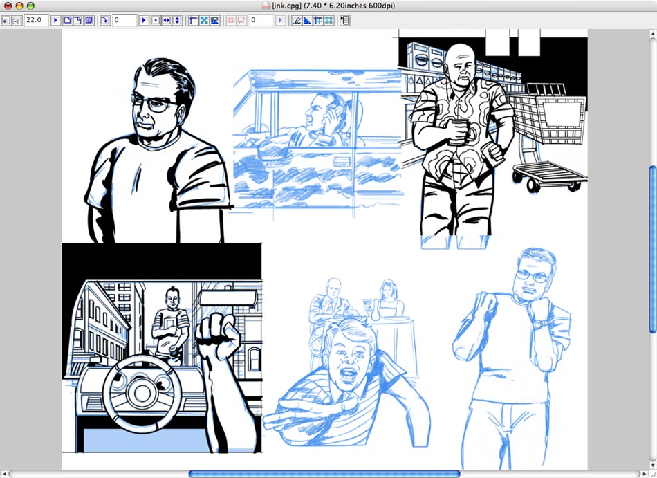
Now I bring those intermediate “sketches” into a program called Manga Studio, and add stylized black lines, fills, and tone in a process called “inking.” More than just tracing the drawings, this involves a deliberate stylization of the final drawings, giving them a more clean appearance, and trying to make them look more finished overall, while hopefully maintaining some of the energy of the original drawings.
These final inked drawings are then reimported into Photoshop where I make the final decisions regarding the cropping of the images, the composition of the page, the placement and scale of the panels, and the placement of the word balloons. Sometimes seeing the words and pictures together for the first time would motivate me to rewrite some of the dialog, or even to redraw specific panels to make the strip read better.
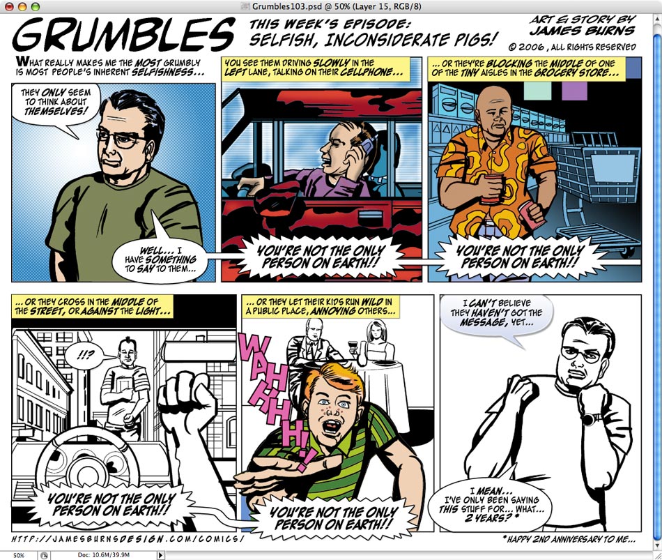
Then I start the coloring process. I apply colors just to the panel layers, and let the inked drawings float on top of them, either using the transparency inherent in the inks, or as a “multiplied” layer effect. I often have to isolate the individual figures from their backgrounds, in order to apply the color to the different part of the image.
Photoshop has lots of tools for this, but I most frequently use the pen tool to make editable vector selections to select specific areas and then apply color to the panels. I have a certain palette I use, and I try to be consistent with certain things, like the green of my favorite shirt, or the grey of my hair, or the skin tone I use.
For someone like me who has spent a large part of their careers working with video colors (based on the RGB color model), the restrictions placed on printing inks (using the CMYK color model) can be frustrating sometimes. Colors are more bright and vivid in the video world, and when the final product is printed on an offset press, using the four-color process on crappy newsprint, sometimes the final result is disappointing.
After I’m happy with the strip, I use an automated “action” in Photoshop to separate the black type from the colored drawings (this seems to make the type print clearer, and makes the colors a little more vivid...), save them both as TIFF files, which I later email weekly to the Sunday Paper.
The final result can be seen here.
